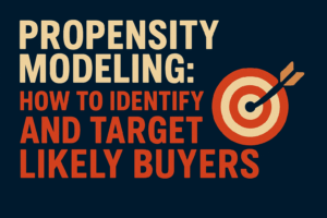
Understanding who is likely to purchase allows you to optimize your efforts. How do you do this?
Read MoreWhy Most Dashboards Fail—and How to Build One That Doesn’t
It’s estimated that up to 90% of BI dashboards go unused after just six months. Think about that. Months of work—strategy sessions, data modeling, design rounds—wasted. Not because the dashboards are ugly, or the data is wrong, but because they’re not built to answer the questions that matter. I know this firsthand—because I built one of those 90%. What follows is the story of that failure, the hard-earned lesson it taught me, and the simple framework that has since turned my dashboards into indispensable decision engines. If you’ve ever built a dashboard that got praise but no pageviews, this one’s for you.
The Dashboard No One Used: How I Learned to Build for Action, Not Approval
Let me set the stage. I was a brand-new data analyst—two weeks out of onboarding, still nervously triple-checking my SQL syntax before every meeting. Hungry to prove myself, I jumped at the first high-profile assignment: “Could you build a marketing metrics dashboard?” Cue the Rocky music. This was my moment. My chance to show I could do more than occupy a desk. I wasn’t just going to build a dashboard—I was going to build the dashboard.
Step One: I Did What Made Sense
I took the logical first step: talk to the users. I sat with every marketer—SEO specialists, paid ads pros, social media managers—and asked: “What do you wish you could see in one place?” I wrote everything down. I mapped it all out, built a mockup, and scheduled a review session. The response? Unanimous praise. Everyone nodded along. “This will be a game changer.” “Exactly what we’ve been missing.” Slack emojis flew like confetti. I walked out of that meeting feeling like I had just launched the iPhone of marketing dashboards.
Step Two: The Big Launch
Delivery day arrived. The dashboard was fast. Clean. Cross-functional. I even added a “marketing scoreboard” at the top—because, why not? It looked amazing and worked like a charm. The feedback? Overwhelmingly positive. I took a quiet victory lap. I felt like I had made it.
Step Three: The Ghost Town
Two months later, I checked the usage stats. Crickets. Not just low usage—no usage. Tumbleweed rolling through a ghost town kind of silence. I assumed something was broken. Maybe the tracking was off? Maybe the links didn’t work? Nope. Everything was fine. So, I started asking around: “Hey, noticed not many people are using the dashboard. Anything wrong?” And that’s when I got the killer answer: “Oh yeah… I already know those numbers. I don’t really need to look at it.” Gut punch.
Step Four: The Hard Lesson
At the time I didn’t know how to overcome this issue, it seemed like such a logical way to go about building the executive dashboard. However, over the next 10 years I learned a new trick that is key to maximizing not only your dashboarding, but just about everything in your business. The culmination of 10 years of experience can be summed up in the next section.
Why Most Dashboards Fail: They Don’t Answer These Two Simple Questions
Hopefully, you’ll learn from my story that the issue wasn’t just a bad dashboard—it was a good dashboard that lacked actionable clarity. When people opened it, their response wasn’t “This changes how I work,” it was “That’s nice… now back to my real job.” It didn’t drive behavior—it decorated it. But the root of the problem wasn’t in the visuals. It was in the questions I failed to ask before I ever touched a single data source.
Fixing This Common Mistake
To build something that gets used—something that makes a difference—you need to ask two dead-simple but business-transforming questions:
- What are we trying to achieve?
- How will we know if we did that?
These questions sound basic. But they are power tools disguised as sentence fragments. Ask them earnestly, answer them clearly, and you’ll avoid 90% of the dashboard disasters I’ve seen (and created).
Before we break them down, remember three simple rules:
- Ask early. These should be the first things you discuss in a kickoff, before design mockups or budget lines.
- Ask in order. Define the why before the how. Starting with metrics before goals invites vanity metrics to sneak in and take over.
- Write it down. Capture the answers. Stick them on the whiteboard. Paste them at the top of your dashboard doc. Make them your north star.
Question One: What Are We Trying to Achieve?
This defines the business outcome. Not a KPI. Not a metric. A clear, human-understandable objective. Something like:
“We want to increase the average order value among new customer cohorts by encouraging higher-tier bundle purchases.”
That sentence says nothing about charts—but everything about purpose.
Why This Matters:
- Clarity & Alignment: Everyone knows why this dashboard exists and what it’s aiming to improve.
- Scope Guardrails: You resist the urge to track everything just because you can.
- Buy-In: Stakeholders aren’t just approving your work—they’re rooting for its success.
Question Two: How Will We Know If We Did That?
This is where you translate intent into measurement. For the above outcome, you might say:
- Primary Metric: Average Order Value (AOV) among new customers
- Target: Increase AOV from $65 to $80 within 8 weeks of launch
Now you’ve got a scoreboard—not just a pretty interface.
Why This Matters:
- Feasibility Check: Do we even have the data to measure this? If not, you’ve saved yourself weeks of false progress.
- Team Alignment: Everyone knows what “winning” looks like.
- Avoiding Vanity Metrics: No more chasing likes, impressions, or vague traffic goals. Only data that proves ROI.
When you start with these two questions, you’re no longer building a dashboard—you’re building a decision engine. One that your team will actually use. One that changes behavior. One that delivers on the promise of data.
In the next section, I’ll walk you through how to apply these two questions to your next dashboard project—and how to turn the answers into a design that drives real, measurable action. Stay tuned.
What a High-Performing Dashboard Looks Like in the Real World
So how do those two critical questions—“What are we trying to achieve?” and “How will we know if we did that?”—actually show up in a real dashboard? Let me show you, because this time… I got it right. Below is the Executive Summary Dashboard I delivered for a client in February. And unlike my first dashboard disaster, this one didn’t gather dust—it got used, in the monthly executive meeting. Why? Because it answered those two questions clearly and visually, every time someone opened it.
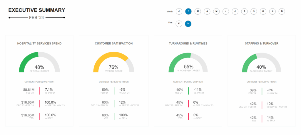
What Are We Trying to Achieve?
The business goals were straightforward, but powerful:
- Control hospitality services spend to stay within budget.
- Improve customer satisfaction across departments.
- Increase operational efficiency by reducing turnaround times.
- Reduce staff turnover and stabilize team performance.
That’s it. No fluff. No ten-point mission statement. These were clearly defined, organization-wide priorities that told you exactly what was important to the business and without knowing these numbers you would be in for a bad time.
How Will We Know If We Did That?
Here’s where the dashboard shines. It doesn’t just show numbers—it defines success and shows progress against targets using gauges and pre-defined time cuts:
- Hospitality Services Spend: 48% of total budget used YTD. Clearly signals strong budget control, reinforced with monthly and year-over-year comparisons.
- Customer Satisfaction: 76% overall score. The change from last period (-5%) is highlighted, giving quick insight into recent decline despite strong historical performance.
- Turnaround & Runtimes: 55% of target achieved. The dashboard shows both current period performance and whether we’re on track YTD—highlighting opportunity areas.
- Staffing & Turnover: 40% of target achieved, but improving (-3% vs. last month), signaling forward momentum and areas needing support.
By using a mix of gauges, clear percentage changes, and time comparisons, this dashboard creates a shared understanding across leadership:
- Are we on track?
- Where should we investigate deeper?
This dashboard didn’t try to answer everything—it answered the right things. It was grounded in business outcomes and backed by measurable success criteria. It served as both a strategic compass and an early-warning system. After being warned the user than could take the action of following a decision tree to identify potential causes.
The result? Leaders actually used it. It guided conversations. It influenced resourcing. It drove action. And more importantly? It avoided the fate of my first dashboard. It didn’t become “just another tool.” It became the tool they relied on.
Ready to Build a Dashboard That Actually Drives Results?
If you’ve made it this far, one thing should be clear: a dashboard is only as valuable as the decisions it empowers. My early failure taught me that beautiful design means nothing if your team doesn’t know what to do with the data. But when you build around clear outcomes—and only track what moves the needle—that’s when dashboards become indispensable.
Still wondering which metrics actually matter?
That’s exactly why we created “From Chaos to Clarity: The DTC Metrics Hierarchy.” It’s a free, actionable guide that breaks down the essential metrics every direct-to-consumer brand should be tracking—grouped by strategic priority, not just vanity.

Looking to supercharge your business with data analytics? Check out these articles next.

Why Do American-Made Brands Keep Losing Money to Hidden Wastage?
As an American-made manufacturer, you've relentlessly optimized your production line, yet three hidden wastage points beyond your view still threaten your profitability and even your business survival.
Read More
How Can American Made DTC Manufacturers Benefit From Sales Attribution?
Break Open the Black Box—Unlock the Power of Sales Attribution for American-Made DTC Brands.
Read More