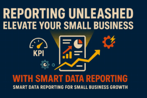
Reporting is often the most overlooked piece of data analytics. Reporting is the key cog in the data analytics.
Read More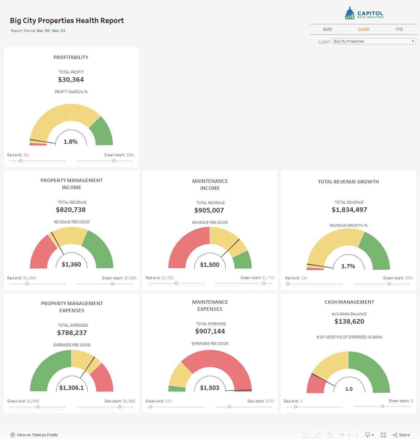
QuickBooks Online (QBO) has long been a staple for small businesses, offering a suite of tools designed to facilitate basic financial management and reporting. While it excels in streamlining accounting processes, many businesses find themselves grappling with its limitations, particularly when it comes to comprehensive and customizable reporting. The need for deeper insights and more dynamic data visualization is pushing businesses to look beyond traditional accounting software reports.
Enter Tableau, a powerful data visualization tool that transforms the way businesses analyze and report their data. Unlike QuickBooks Online, which offers limited reporting capabilities, Tableau opens up a world of possibilities, allowing for the creation of customizable dashboards that not only simplify data analysis but also enhance it. This makes Tableau a perfect companion to QuickBooks Online.
The shift from QuickBooks Online reports to Tableau dashboards represents more than just a change in software; it signifies a strategic move towards data-driven decision-making. This transition acknowledges the critical role that data visualization plays in today’s business environment, where the ability to quickly interpret and act on data can set a company apart from its competitors.
This article explores the limitations of QuickBooks Online for reporting, highlights how Tableau dashboards can offer a superior alternative and the steps you can take to take advantage of Tableau’s capabilities. Whether you’re a seasoned data analyst or a business owner seeking to elevate your reporting capabilities, understanding the benefits of transitioning to Tableau dashboards can be a game-changer for your business.
QuickBooks Online has established itself as a cornerstone for many small to medium-sized businesses seeking an efficient way to manage their accounting needs. With its user-friendly interface and a wide range of financial management features, it provides a solid foundation for basic accounting tasks. However, when it comes to reporting capabilities, businesses often encounter several limitations that can hinder their ability to fully understand and utilize their financial data. QuickBooks limitations are outlined below.
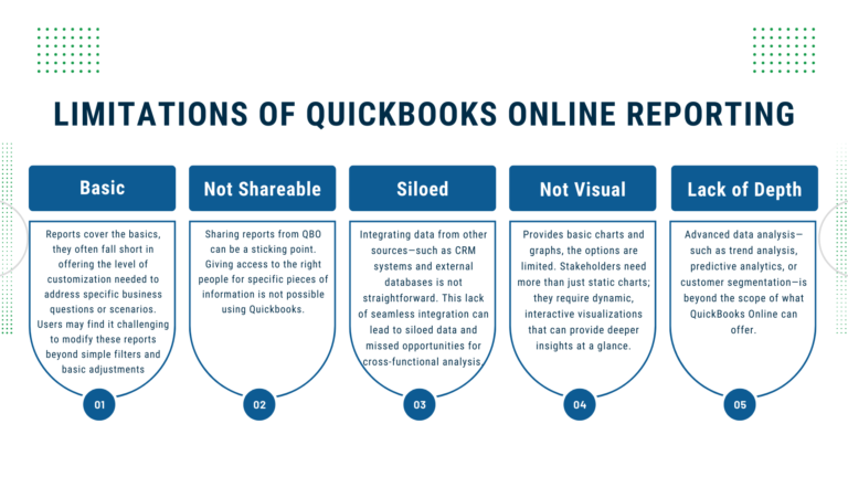
QuickBooks Online offers a variety of pre-built report templates, such as profit and loss statements, balance sheets, and expense reports. While these templates cover the basics, they often fall short in offering the level of customization needed to address specific business questions or scenarios. Users may find it challenging to modify these reports beyond simple filters and basic adjustments, making it difficult to tailor the analysis to their unique business needs.
Sharing reports from QBO can be a sticking point. Giving access to the right people for specific pieces of information is not possible using Quickbooks. So, to get reporting to others in your organization you have to export the data and manually put it together in excel.
As businesses grow, so does the complexity of their financial data. Integrating data from other sources—such as CRM systems, external databases, or cloud-based applications—into QuickBooks Online reports is not straightforward. This lack of seamless integration can lead to siloed data and missed opportunities for cross-functional analysis.
Another significant limitation of QuickBooks Online is its visual representation of data. While it does provide some basic charts and graphs, the options are limited in scope and customization. The ability to quickly grasp complex data through advanced visualizations is crucial. Stakeholders need more than just static charts; they require dynamic, interactive visualizations that can provide deeper insights at a glance.
For businesses looking to dive deeper into their financial data, QuickBooks Online’s reporting features may prove insufficient. Advanced data analysis—such as trend analysis, predictive analytics, or customer segmentation—is beyond the scope of what QuickBooks Online can offer. Businesses needing these types of insights must look to additional tools and software to provide these analyses.
In summary, while QuickBooks Online serves as an excellent tool for financial management and accounting, its reporting features leave much to be desired for businesses aiming for deeper insights and more sophisticated data analysis. The limitations in customization, scalability, data integration, visual representation, and advanced analytical capabilities prompt the need for a more powerful solution. As we will explore in the next section, Tableau offers an alternative that not only addresses these limitations but also significantly enhances a business’s ability to analyze and report on their financial data.
Tableau is a leading tool in the realm of data visualization, offering capabilities that extend far beyond QuickBooks Online reports. In order to show the power of using your QuickBooks Online data with Tableau, we will use a real life example.
The dashboard was created to help a fractional CFO provide financial services to property management companies. This version has been modified and the data spoofed so as to not give up secrets, but it still shows the value of using Tableau as an enhancement to your QuickBooks Online reporting.
Note this dashboard is meant to display on a desktop, so if you are viewing on a different device it may not be formatted correctly.
Let’s break down this dashboard to see how it delivers on the weak points of QuickBooks Online reports.
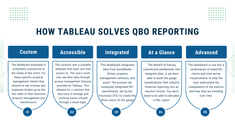
Build Customized Dashboards
The dashboard displayed is completely customized to the needs of the client. For these specific property management clients they wanted to see revenue and expenses broken up by the two sides of their business property management and maintenance. This dashboard allows us to easily differentiate the two sections and customize as necessary.
Additionally, the stoplight gauges can be customized to change what are the red, green and yellow sections using the sliders under the gauge. This is helpful if you need to make small tweaks to your KPIs and don’t want to manually change the calculations.
Accessible
This solution was a scalable template that each user had access to. The users could only see their data through access management features provided by Tableau. This allowed for a solution that was easy to manage and could be easily utilized through a cloud login.
Integrated Data
This dashboard integrates data from QuickBooks Online, property management software, and excel. The process we employed integrated KPI benchmarks, set by the fractional CFO, to create the three colors of the gauge, so you can understand where the financial performance falls when compared to goals. Additionally, information about the number of units is integrated into the dashboard to allow us to provide per door measurements that were not available in QuickBooks Online.
Quickly Grasp Your Data
The benefit of having customized dashboards that integrate data, is we were able to build the gauge visualizations that simplify financial reporting into an intuitive format. You don’t need to be able to decipher a P&L report to understand where your business is at. Instead you can see right at the top what profitability is and if that is good, bad, or otherwise. If it is bad we can look at the gauges below to understand which components are holding us back.
Advanced Analysis
Even though it is not shown in this public facing version of the dashboard, the dashboard in use has a combination of waterfall charts and time series visualizations to help the user understand the components of the metrics and how they are trending over time. This allows the user to gain insight into what is actually happening with their business.
One area that could be added to the dashboard is the use of predictive analytics to predict where the business is going. This would allow the business to get ahead of any potential problems such as slowing revenue or increasing expenses.
The transition from QuickBooks Online’s reporting capabilities to Tableau’s advanced dashboards represents a significant upgrade in how businesses can visualize, analyze, and interpret their financial data. This section provides a practical guide to making this transition, ensuring businesses can leverage the best of both worlds: the comprehensive accounting functionalities of QuickBooks Online and the sophisticated data visualization and analysis capabilities of Tableau.
Step 1: Get Your Data
While Quickbooks Online will still operate as the data creation tool, we need to make the data available to Tableau for reporting. To do this there are three main options.
Step 2: Clean Your Data
Having clean data is by far the most important piece of data analytics. Garbage in, Garbage out, so make sure your data is accurate. Here is a framework you can follow to go about cleaning your data.
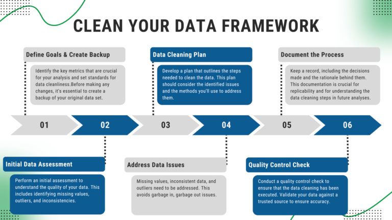
Define Data Quality Goals & Create a Backup: Clearly define what good data quality means for your analysis or business objectives. Identify the key metrics or attributes that are crucial for your analysis and set standards for data cleanliness.
Before making any changes, it’s essential to create a backup of your original data set. This ensures that you can restore to the starting point if something goes wrong during the cleaning process.
Initial Data Assessment: Perform an initial assessment to understand the quality of your data. This includes identifying missing values, outliers, and inconsistencies.
Data Cleaning Plan: Develop a plan that outlines the steps needed to clean the data. This plan should consider the identified issues and the methods you’ll use to address them.
Address Data Issues: Here are some common problems you may need to address in your data.
Document the Process: Keep a record of the cleaning process, including the decisions made and the rationale behind them. This documentation is crucial for replicability and for understanding the data cleaning steps in future analyses.
Quality Control Check: After cleaning, conduct a quality control check to ensure that the data cleaning has been executed as per the defined standards and goals. Where possible, validate your data against a trusted source or through cross-reference within the dataset to ensure accuracy.
Step 3: Display Your Data
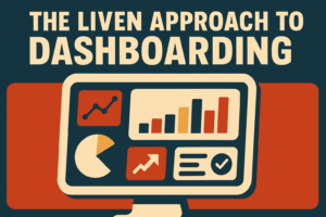
Now that the data is accurate and available, you will want to build a dashboard that is informative and provides deeper insights into your Quickbooks data than what can be provided directly in QBO. If you are looking for a framework to approach building dashboards, check out our LIVEN approach to dashboard building.
QuickBooks Online has long stood as a reliable companion for small businesses, providing a straightforward suite of tools for financial management and reporting. However, the need for more comprehensive, customizable, and dynamic reporting is becoming increasingly evident. Businesses are now recognizing that basic reporting, while foundational, is no longer sufficient in a landscape where data-driven decision-making is paramount. The answer to this growing demand for deeper insights lies not within the confines of traditional accounting software but in the robust capabilities of advanced data visualization tools like Tableau.
Tableau offers a platform that dramatically transforms the way businesses approach their financial data. It transcends the limited reporting capabilities of QuickBooks Online by enabling the creation of fully customizable dashboards. These dashboards not only streamline complex data analysis but also enhance it, providing clear, interactive, and insightful visual representations of financial metrics that are pivotal for strategic decision-making.
Through the course of this article, we’ve dissected the inherent limitations of QuickBooks Online and cast a spotlight on the expansive benefits offered by Tableau dashboards. By marrying the detailed financial data from QuickBooks with the sophisticated analytical prowess of Tableau, businesses can now unlock the full potential of their financial data, gaining the clarity and insight needed to forge ahead.
In conclusion, as businesses navigate the complexities of modern financial landscapes, the integration of QuickBooks Online with Tableau dashboards stands as a formidable alliance. It promises not just an incremental improvement in reporting but a revolutionary leap towards insightful, data-driven business intelligence. For those ready to make this leap, the path is clear: embrace Tableau’s advanced dashboards and unlock a new horizon of possibilities for your business intelligence and decision-making prowess.
Reporting is often the most overlooked piece of data analytics. Reporting is the key cog in the data analytics.
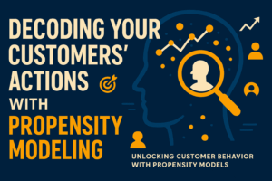
Read MorePropensity models are a group of statistical models that provide immense value to your organization.
Read MoreDashboards are the lifeblood of business reporting, but how do you know that the dashboard you are building will be valuable...
Read MoreNOT GETTING THE INSIGHTS YOU NEED OUT OF QUICKBOOKS? LEARN MORE ABOUT HOW THE CATALYST PROGRAM CAN TAKE THE GUESSWORK OUT OF FINANCIAL REPORTING.