
Break Open the Black Box—Unlock the Power of Sales Attribution for American-Made DTC Brands.
Read MoreTableau Dashboard: Tame The Owner-Overload Bottleneck
Jeremy was drowning in store reports—different formats, different files, all landing in his inbox. Every morning turned into a scramble to duct-tape numbers just to see pacing, profit per store, and product sales. “I can continue to do this, but I have to do a lot of manual processes and I feel like it could be easier. My dream would be I just click on a button and I can see where I’m at and where I’m projecting.”
That’s the Owner-Overload Bottleneck: when the person who must make decisions is stuck building spreadsheets. In this article, you’ll see the simple steps Jeremy used to break the bottleneck—so time shifts from data wrangling to decisive moves that quickly build margin.
The Root Causes of the Owner-Overload Bottleneck
To fix the bottleneck, start by seeing what creates it. Three forces are at work.
1) Data that doesn’t speak the same language. Sales, ads, and ops report on different grains and calendars—spend/clicks in ad platforms, sessions in analytics, orders/COGS/fees in the back office. Because nothing is normalized, metrics won’t align to the same customers or periods. You end up comparing apples to oranges and rebuilding the math each morning just to trust today’s number. As one operator put it, the dream is to “have everything in one spot”—but until that exists, the owner becomes the human integration layer.
2) The Five-Minute Myth. “It’ll only take five minutes—I’ll do it myself.” Those “quick fixes” stack up into an invisible tax: context switching, re-downloading, copy-pasting, sanity checks. A five-minute task becomes an hour-long slog. Worse, it creates a single-threaded process—everyone waits for the owner to finish the glue work before decisions can move.
3) Report sprawl and unclear recipes. Ten versions of the same KPI and undocumented metric definitions push teams to screenshots, inbox reports, and one-off spreadsheets. Without a shared model, parameters, and a publish-once/export-everywhere pattern, the default becomes “Jeremy will pull it together.” High-stakes decisions get gated by low-value assembly—and the business pays with missed targets and margin erosion.
The Solution: Taming Chaos With One Screen
If the bottleneck is built from mismatched data, “five-minute” glue work, and report sprawl, the antidote is focus. Instead of asking the owner to be the human integration layer, we make the system do the integrating. That means one canonical model, one place to see truth, and one screen that moves decisions forward in seconds—not after a morning of copy-paste.
Build one production-grade Tableau dashboard that puts the metrics that matter on the same footing—same grain (customer/order/market), same time windows, same definitions. The heart of the fix is a unified data model that normalizes ads, analytics, and orders into a single table you can trust. From there, the dashboard becomes a decision surface: apples-to-apples comparisons across time, channel, market, and cohort, plus pacing math and adjusted goals so leaders can see where they are and how to catch up—on desktop or phone.
What changes immediately
- Minutes, not mornings. The daily “glue work” disappears—no more downloads, copy-paste, or reconciliation just to trust today’s number.
- One truth for all. From finance to marketing everyone is aligned over exactly what matters and can trust the definition of that metric.
- From vanity to accountability: Decisions shift from what makes my group look good to which actions are profit drivers.
Actions Steps To Deliver The Solution
Below is a copy-ready plan you can follow. Each step maps directly to the bottlenecks we surfaced and ends with a concrete “how to ship it” note.
1) Define the canon (no debate, just recipes)
Create a one-pager that locks the math before you build visuals. This one pager defines exactly what metrics matter for your business and how to define them. If you need a refresher on the metrics that matter, read our Metrics Article.
- Profit = Net Revenue − (COGS + Fulfillment + Variable Fees + Media) at the order or customer cohort level.
- CAC = Total Attributable Media ÷ New Customers (use the same attribution window you’ll use for LTV).
- LTV = Sum of Contribution Margin over X days (e.g., 90/180/365).
Tip: Map each term to real fields (Shopify/ERP order tables, ad platform spend, fees). Paste this one-pager into a “Definitions” page in Tableau so every user sees the same rules.
2) Model the data once, use everywhere
Unify ads, analytics, and orders so everything points to the same data table.
- Build a warehouse view (or Tableau Prep flow) keyed by customer_id, order_id, acq_channel, acq_month.
- Precompute: contribution at the order level, CAC at the cohort × channel level, cohort start/end dates.
- Output a thin, analytics-ready table that anyone can read—no joins in worksheets.
Tip: Name the view something canonical (e.g., mart_kpi_profit_cac_ltv). Add a data quality check (row counts, null scans) on refresh.
3) Make the view defined, not prolific
Kill dashboard spread by deciding—up front—what cuts of the data actually drive decisions. “I wish this were more flexible so I could do everything” is a symptom of an undefined decision model, not a visualization problem. A production dashboard is not a playground; it’s a decision surface. If a slice doesn’t change a decision, it doesn’t belong.
How to define (and constrain) the view
- Write the Decision Question Bank (max 6): e.g., Are we on payback policy by channel? Which markets are diluting margin? Which cohorts recover CAC by day 90? If a question isn’t in the bank, it doesn’t get a card. Ask yourself if I knew the answer to this question, how would it help my decision making?
- Choose Canonical Cuts (pick 3–5):
- Time: MTD / QTD / 90 / 180 / 365 (no arbitrary dates).
- Acquisition Lens: Channel and Market (region/store).
- Cohort: Acquisition Month (first order) or First Touch (pick one primary; allow a toggle if truly needed).
- Segment (optional): New vs. Repeat or High-Value segments only.
Everything else goes to the Exports page—not the main canvas.
- Time: MTD / QTD / 90 / 180 / 365 (no arbitrary dates).
- Anti-patterns to avoid: kitchen-sink filters, ad-hoc date pickers, every dimension on the shelf, and “view per stakeholder” clones. Those recreate sprawl inside one workbook.
When you define the view this way, flexibility shows up where it matters—in decisions—not in an endless menu of filters. The result is fewer screens, faster answers, and a team that treats the dashboard like a cockpit, not a cockpit’s junk drawer.
4) Build the Profit • CAC • LTV triad on one canvas
Lay out a single screen that drives decisions in seconds.
- Executive Dashboard — Executive Pulse: Profit, CAC, LTV against goal and sparklines to show trending.
- Tactical Dashboard — Drivers: Channel × Market matrix of Contribution After Media with win/hold/cut highlighting.
Tip: Use a grid (3 rows) and consistent card sizes. Keep text big; every tile tappable for drill-through.
5) Add pacing & adjusted goals (turn targets into to-dos)
Make the path to “on plan” explicit. More on how to set good KPI targets here.
6) Right-Size Access for Decisions (Not Just Licenses)
Your goal isn’t “everyone in Tableau”; it’s the right info to the right person at the right cadence so they can decide and act. Design access by decision level, not by org chart.
Access tiers that map to decisions
- Tier 1 — Owners & Execs (Strategic):
Need: pulse on Profit • CAC • LTV • Payback, pacing vs. goal, exception flags.
Delivery: interactive Pulse view (desktop + phone) with weekly Board PDF.
Guardrails: read-only; limited controls (Date Horizon, Channel/Market). - Tier 2 — Directors/Managers (Tactical):
Need: channel × market matrix, cohort breakeven, “fix or cut” candidates.
Delivery: interactive workbook with row-level security (RLS) by region/brand; Monday CSV drop for planning.
Guardrails: parameters exposed; drill-through to transactions; no schema edits. - Tier 3 — Operators (Operational):
Need: today’s targets, exception lists (stores/channels off policy), action checklists.
Delivery: Scheduled PDF (2–3 pages) and CSV to inbox/Slack; minimal interactivity.
Guardrails: no access to sensitive cost fields; surface only what drives today’s actions. - Tier 4 — Analysts/Finance (Diagnostic):
Need: full grain for reconciliation, variance analysis, assumption checks.
Delivery: interactive with Data Source access to mart_kpi_profit_cac_ltv; Exports page with raw tables.
Guardrails: versioned metric recipes; change log.
Mechanics that keep this lean and helpful
- Row-Level Security (RLS): one workbook, many perspectives (store/region/brand/user role).
- Scheduled bursts: PDFs/CSVs on a cadence that matches decisions (daily for ops, weekly for execs).
- Event-based alerts: notify only when Payback > policy, Pacing < target, or Contribution After Media turns negative.
This approach addresses the “I don’t want to have 100 licenses” concern by reducing interactivity where it isn’t needed and increasing clarity where it is—so every role gets precisely what they need to make faster, better decisions.
7) Centralize exports (end screenshot chaos)
Make sharing boring—in a good way.
- A single Exports page with raw tables (CSV) and board-ready PDFs.
- Include a timestamp, parameter summary, and metric definitions footer.
Tip: Pre-format PDFs at 16:9 and letter sizes; include your logo and the report title.
How These Steps Handle the Exact Objections You’re Thinking
Here’s the part where the doubts show up—and get quietly dismantled. If you’re thinking, “licenses will explode,” “we’re a Power BI shop,” “our data is a mess,” or “this will spawn a dozen dashboards,” you’re not wrong to worry. But the way the steps are built—unified model first, parameterized views, role-based access, exports-first integration—means each objection was addressed by the design itself. Read the specifics below to see how the exact steps you just walked through translate into lean licenses, tool flexibility, fast integration, and zero sprawl.
- “We’ll need too many Tableau licenses.”
We right-sized access: Row-Level Security + scheduled PDF/CSV bursts for ops, a phone-ready Pulse for execs, and interactive access for analysts only. The result is broad visibility without seat sprawl. - “We already have Power BI—why Tableau?”
We modeled the data once in a tool-agnostic mart. The dashboard layer is a skin; the definitions and joins live below it. If your standard is Power BI, you keep the same model and plug in a PBI canvas. - “Our data is everywhere; joining it will take forever.”
We started Exports-first, APIs-later. Week one shipped a working screen off scheduled CSVs; subsequent sprints swapped in live connectors without changing the layout or the math. You got value immediately, stability shortly after. - “We don’t want a dozen versions of the same dashboard.”
We defined the view and parameterized it. A single workbook with canonical cuts (Date Horizon, Channel/Market, Cohort Type) replaces copies. One Exports page handles the edge cases. Sprawl didn’t have a chance.
Apply The Process To Real Data
For the
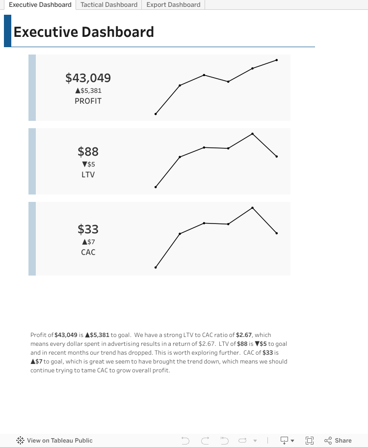
Executive Dashboard — Pulse & Trajectory
Purpose: Answer two questions fast: Are we on plan? and Is the trend improving or slipping?
What’s on screen:
- Pulse tiles: Profit, CAC, LTV vs goal and mini trends.
- Plain-English summary: A one-paragraph readout that translates the metrics into actions.
When to move on: A tile flags red or payback drifts past policy → click through to the Tactical view.
Tactical Dashboard — Drivers & Decisions
Purpose: Break the triad (Profit • CAC • LTV) into the drivers that actually change outcomes.
What’s on screen:
- Focused breakouts: Product Category, Customer, Customer Segment—only the cuts that inform action.
How to use it: Spot the “why” behind a red tile, align on a fix-or-cut plan, and set the new run-rate to get back on pace.
Export Dashboard — Share & Dig Deeper
Purpose: End screenshot chaos and ad-hoc pulls.
What’s on screen:
- Preformatted CSV packs: everything you need in one place for further, what if scenarios.
Why it matters: Analysts get the grain they need; leaders get consistent artifacts—no new dashboards required.
Result: One source, one screen, one story—so the system does the stitching and your team does the deciding.
From Chaos to Confident Growth
When you strip out the Owner-Overload Bottleneck, everything speeds up. A single, unified dashboard replaces morning glue work with a clear pulse: Profit, CAC, and LTV on the same footing; adjusted goals that center the data; and defined views that point managers to the real drivers (channel, market, cohorts). With right-sized access and a dead-simple Exports page, finance, marketing, and ops finally argue decisions, not numbers—protecting margin and accelerating growth.
If you want help building your own “one-screen” system, talk to an expert. We’ll review your current reporting, outline the canon for your metrics, and map the fastest path to a low-friction one screen fix. Next step: get time with one of our advisors and we’ll set up a 15-minute consult to point you in the right direction—whether you build it in Tableau, Power BI, or both.
Looking to supercharge your business with data analytics? Check out these articles next.

Why Do American-Made Brands Keep Losing Money to Hidden Wastage?
As an American-made manufacturer, you've relentlessly optimized your production line, yet three hidden wastage points beyond your view still threaten your profitability and even your business survival.
Read More
Performance Measurement for DTC Marketing: Kill Vanity Metrics
Escape the hamster wheel of vanity metrics—learn exactly which KPIs actually drive your revenue and align your team toward measurable growth.
Read More